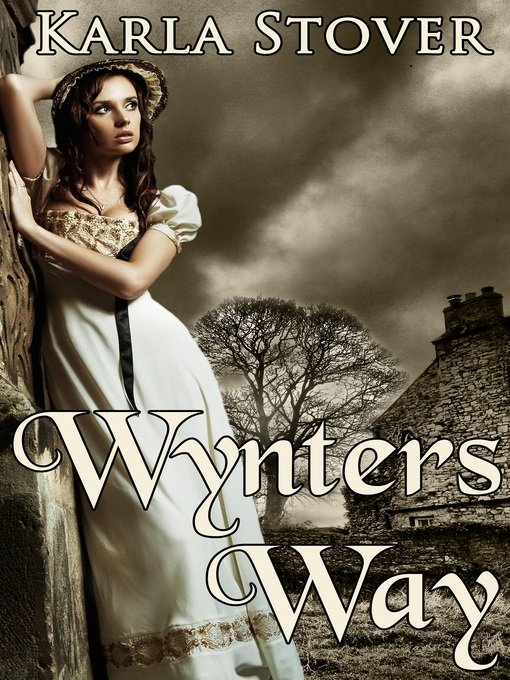
I buy more books, now, than I used to but when I do go to the library or look at the best-sellers lists I get every week, I always consider the cover, first. To this day I don't like the Harry Potter covers and wouldn't have read the books if a so many diverse people hadn't recommended them. I have no idea how publishers choose cover designs. I checked a couple search engines with various combinations of words but couldn't find anything except designs to buy, and one person's blog on the best covers of 2020. Here's the site; you can check it our for yourself but I thought the covers were terrible. https://blog.reedsy.com/best-book-covers.
According to a psychic friend of mine who reads charts at various location, since I am a Capricorn I want perfection in what I read and I am critical if there are mistakes. I also have a Leo rising so I love drama in my reading. Somewhere along the line Saturn, aka The Cosmic Cop, comes into play with Gemini and it all combines to mean I want a well-written, believable mystery. Probably why I avoid cozies.
I can spot the cover of a cozy from half way across the room (only a light exaggeration). Their book jackets are generally made up of bright tertiary colors and can be almost cartoony-looking. They often have animal pictures on them---mostly cats, or food or drinks. The women don't look real. That being said, I saw an Amish cozy today with a real person on the book jacket.
I get books suggestions almost daily via email. Book Adrenaline ( BA )is a regular. They send me pictures and synopsizes of mystery books that I might want to read and that are available to download for practically nothing. Sometimes I try to find one at the library because I don't have an e-reader. Today I looked at three emails received on three different days, and BA's suggestions. This time, the dust jackets, again for the most part, were made up of primary colors with a few secondary colors thrown in. If there was a figure, it tended to be realistic. What I looked at had the titles in bold writing such as round-hand calligraphy or modern brush calligraphy. A cozy will likely include something such as Samantha font or Old English calligraphy somewhere on the cover, i.e. in the title or author's name.
Obviously, the purpose of a book jacket is get a buyer / reader to pick up the book, but that wasn't always the case. "Before the 1820s, most books were published unbound and were generally sold to customers either in this form, or in simple bindings executed for the bookseller, or in bespoke bindings commissioned by the customer." At this date, publishers didn't have their books bound in uniform "house" bindings, so there was no reason for them to issue dusts." Customers would often make their own dust jackets out of wall paper, fur or leather. But throughout the 19th century, if a book did have a removable cover, it was often tossed away, either in the book store or by the purchaser. Some historians say this custom lasted until World War I. Unbelievable.
In the post-war years, however, the dust jackets, often decorated in art deco styles, became collector's items. Imagine a dust jacket being worth more---a lot more--- than the books they covered. One famous example is the jacket of a first edition copy of The Great Gatsby. Without the jacket, the book runs to $1,000 but with the jacket and depending on its condition, the value runs from $20,000 to $30,000 or even more. The importance of the book, i.e. To Kill a Mockingbird, The Maltese Falcon or Catcher in the Rye, for example and overall condition is key to the value. For some lucky book buyers inflation has affected even reprinted books in a good dust jacket. I looked at a list (only one) of best book jackets ( one person's opinion, )and they weren't cute, in fact, they were a bit grim.
Now, in addition to looking for reading material at the library, I have been considering any old dust jackets I have. Nancy Drew, anyone?


I'm your opposite. I ignore covers but hit theback blurb and anything else there to help me choose a book, especially if it's a new author
ReplyDeleteSince I know the authors in large publishing houses rarely have a say in the cover design, I do not fault them for the cover. Each genre has a style, and trends come and go. The blurb does it for me. But I have to say some covers for NYT bestselling authors can be horrible. I guess they do not count on the cover to sell the books, but on the author's reputation. Also, I would like to share that the first paperbacks (before the advent of graphic romance novel covers after WWII) didn't have art on the covers, only a frame, and the title and author's name in bold letters.
ReplyDelete